
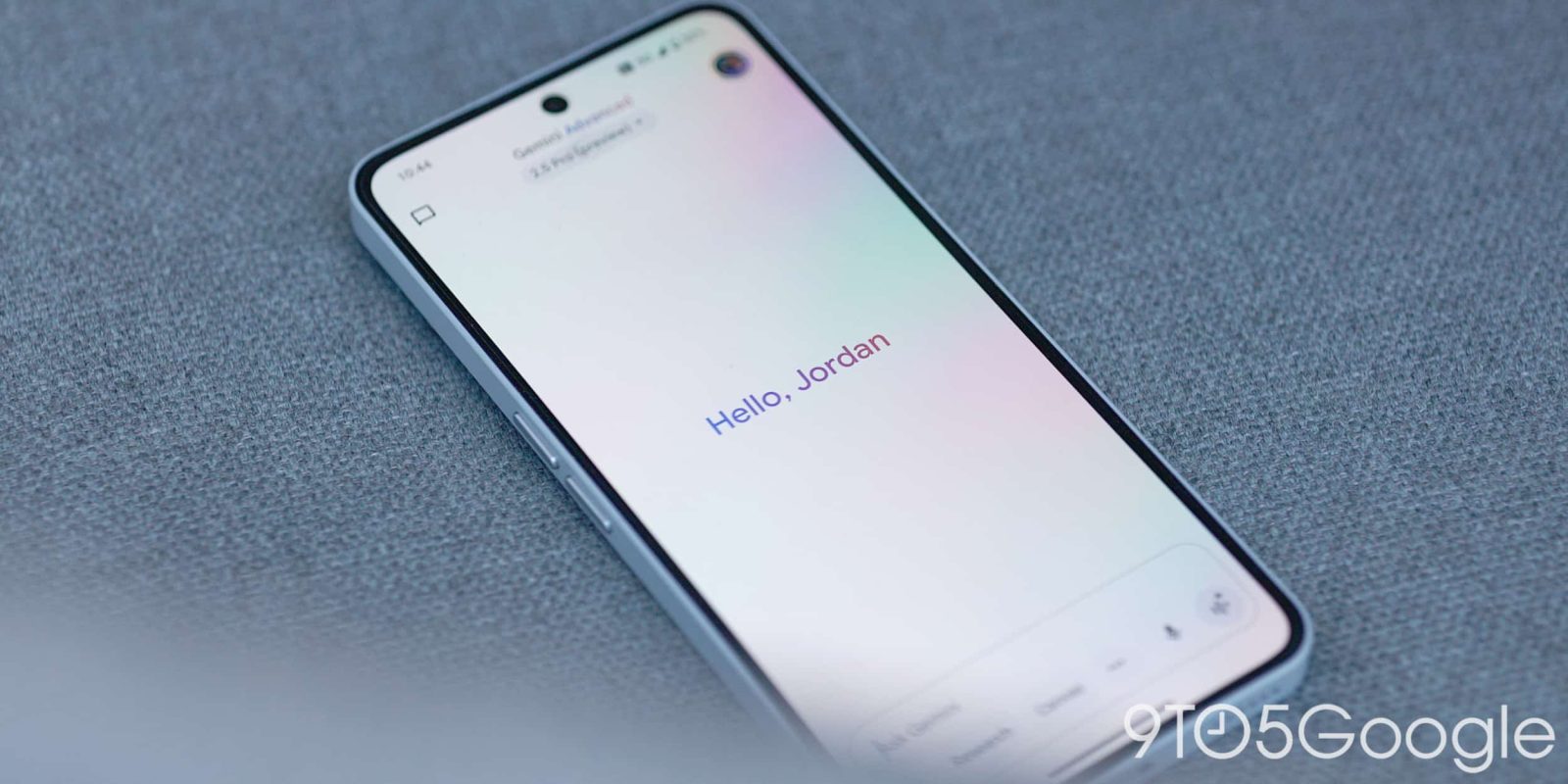
In addition to the 2.5 Pro model update today, Google is also rolling out some UI tweaks to the Gemini app on Android, including a swipe left gesture for Live.
Google today reverted the ‘plus’ menu to a list instead of having side-by-side, pill-shaped buttons for Camera, Gallery, Files, and Drive. With the pre-I/O prompt bar redesign last month, this menu shrunk down a great deal to just show those four items.
This could be a bug, but the list matches the web and iOS (which switched to native floating menus) approaches. Additionally, the Gemini overlay on Android never switched away from the list.
Old vs. new


Meanwhile, Gemini has reordered the chips in the prompt box so that Video (Veo) appears first, with (Deep) Research and Canvas following. This follows the web app. On most devices, you only see two of those items at a time, with the third accessed from the menu.
Speaking of the overflow, an update today made this list a bit more compact (like the model picker above), while Canvas has a new icon. This is its third logo since launch, with Google opting for a split circle instead of a ‘plus’ symbol.


Lastly, you can now swipe left to quickly launch Gemini Live. Serving as an alternative to the corner button, this takes you to the fullscreen interface.
This new gesture is still in the Google app beta channel on Android (wide for iOS), but the other changes are available with the stable release of Google app 16.21 today.


More on Gemini:
FTC: We use income earning auto affiliate links. More.
