
The Google One app on Android is getting a Material 3 Expressive redesign.
Update 7/31: The lack of Dynamic Color was a bug that has been fixed with version 1.272.x of Google One. This redesign is not yet widely rolled out.
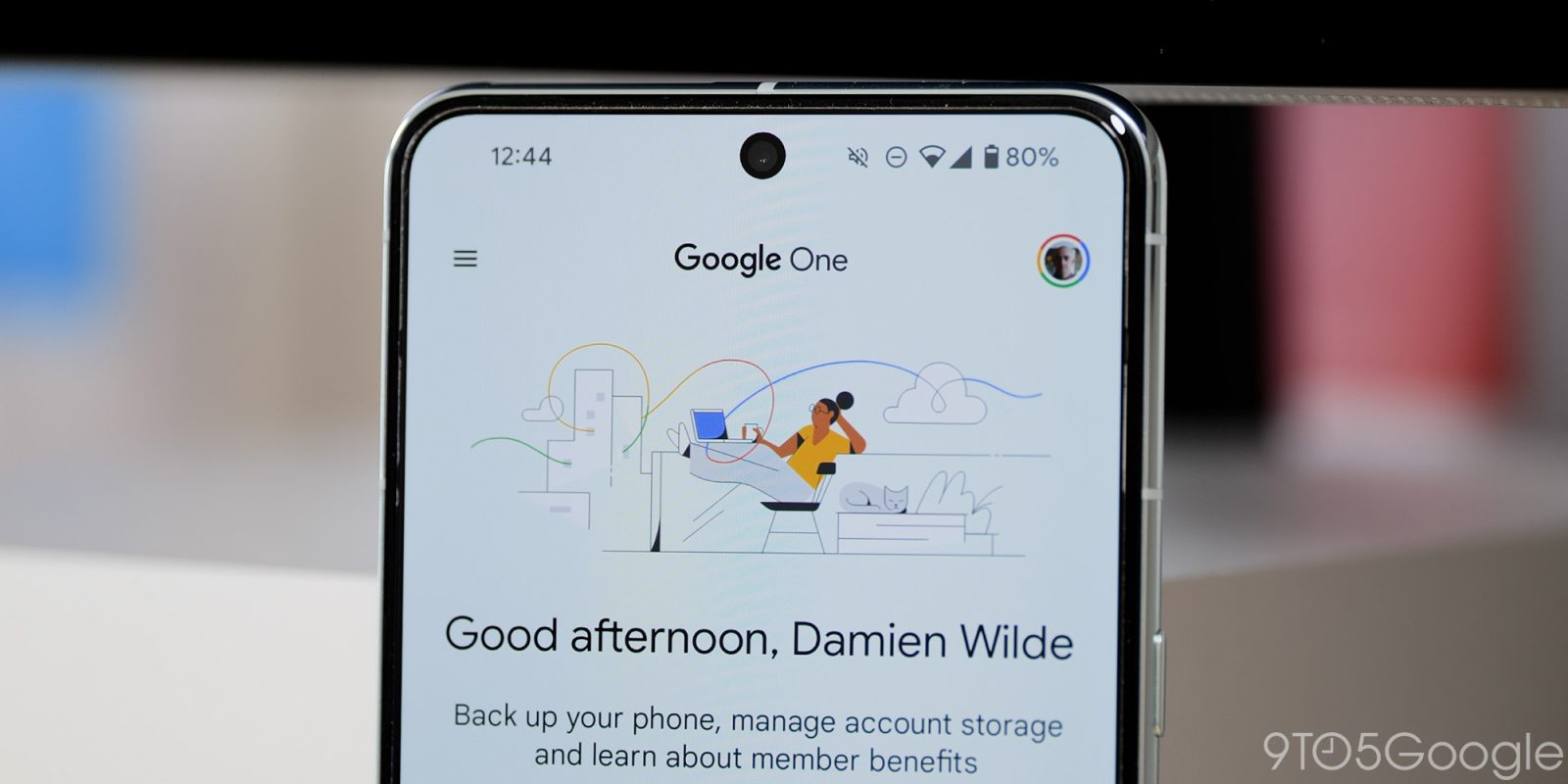
Original 7/29: This redesign starts by removing the friendly illustrations that appeared at the top of every tab. In the Home feed, you immediately get the time-of-day greeting, with the Storage, Backup, and Clean up sections now higher up the screen. Cards throughout the app feature more rounded corners and make use of thin outlines.
The Storage tab places the per-app “details” breakdown in a card with the “Clean up space” button. The “Device backup” sees some tweaks, but is otherwise unchanged today.
Old vs. new
There are similar tweaks to Benefits, while the app’s bottom bar is now shorter. Material 3 Expressive abandons the previous tall style.
Finally, the most obvious expression of M3E is in the Settings list, with no changes to the navigation drawer (or the undersized account image in the top-right corner). There’s a large header, while each item is placed in a card and thematically grouped.
With this Material 3 Expressive redesign, the Google One app is no longer using Dynamic Color. In my case, they go from dark blue to just gray. The bottom bar uses the default blue accent color to highlight the current tab. This could simply be a bug as the status and navigation bars remain themed. However, this look is appearing on two of our devices (Android 16 and 16 QPR1).
We’re seeing this redesign with a server-side update to version 1.271.x of Google One for Android. It’s not yet widely rolled out on all devices we checked today.
More on Google One:
FTC: We use income earning auto affiliate links. More.
