
Yesterday’s iPhone 17 Pro reveal introduced a new design language for Apple, but also a new signature colorway in an orange iPhone 17 Pro and… uh… bring on the orange Android phones. Or, at bare minimum, let’s embrace the return of actual colors on Pro phones.
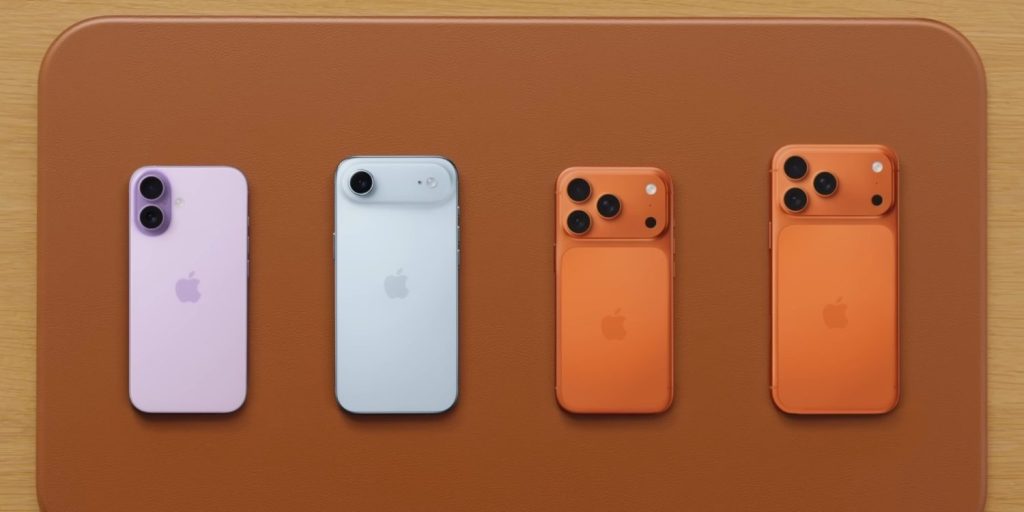
In its new iPhone 17 Pro, Apple has switched back to an aluminum build, ditching the titanium design it hyped up for the past couple of generations. Ultimately, that doesn’t matter seeing as the benefits of titanium were minimal. But it is allowing Apple to introduce a striking new “Cosmic Orange” design.
This new colorway brings back memories of the Pixel 4’s underrated “Oh So Orange,” which was a unique entry at the time. Not only was it one of the most vibrant colors on a smartphone at the time, but orange had been a bit of an outlier up until then. It made rare appearances in accent colors, but it was far from a common choice.
And, since the Pixel 4’s demise, it’s a color we’ve still not seen a ton of. Google somewhat revisited orange in 2022’s “Coral” Pixel 7a, while Motorola also introduced a Razr in orange in some regions. Nothing’s CMF brand has also launched two smartphones in orange.
But, with Apple now adopting orange in the iPhone 17 Pro, the floodgates are open.
It’s almost a guarantee that we’ll be seeing orange pop up in various Android phones over the next year or two because, well, that’s the pattern. If Apple focuses on a new color, Android brands often tend to follow not too far behind in one way or another.
Arguably the bigger deal here, though, is that Apple broke the rule of boring colors on its “Pro” phones.
Almost every smartphone brand, Apple included, is guilty of putting out “Pro” phones with horribly boring color options. A great example of that is the Pixel 10 series, where the base Pixel 10 has some vibrant blue and yellow options, but the Pro lineup is devoid of saturation. As mentioned, Apple usually does the same, with every “Pro” iPhone being some variation of neutral in its colors. Weirdly, the iPhone 17 series just flips this entirely. The base iPhone 17 mostly consists of fairly subdued color choices, while the new iPhone Air comes in black, white, white with some blue, and white with some gold. It’s this “Cosmic Orange” Pro that stands out from everything.
I really hope that Android brands will follow suit, both in vibrant colors on “Pro” devices, and incoporating orange.
But what do you think?
More on iPhone 17 from 9to5Mac:
Much more coverage to come in the next few weeks, though!
FTC: We use income earning auto affiliate links. More.
![]()