
After months of testing, Google is finally rolling out a redesigned video player for YouTube, with its new aesthetic reaching across practically every platform you can imagine. It’s a big change, and thanks to YouTube’s virtual monopoly on traditional long-form video content, it’s something everyone’s bound to have feelings on.
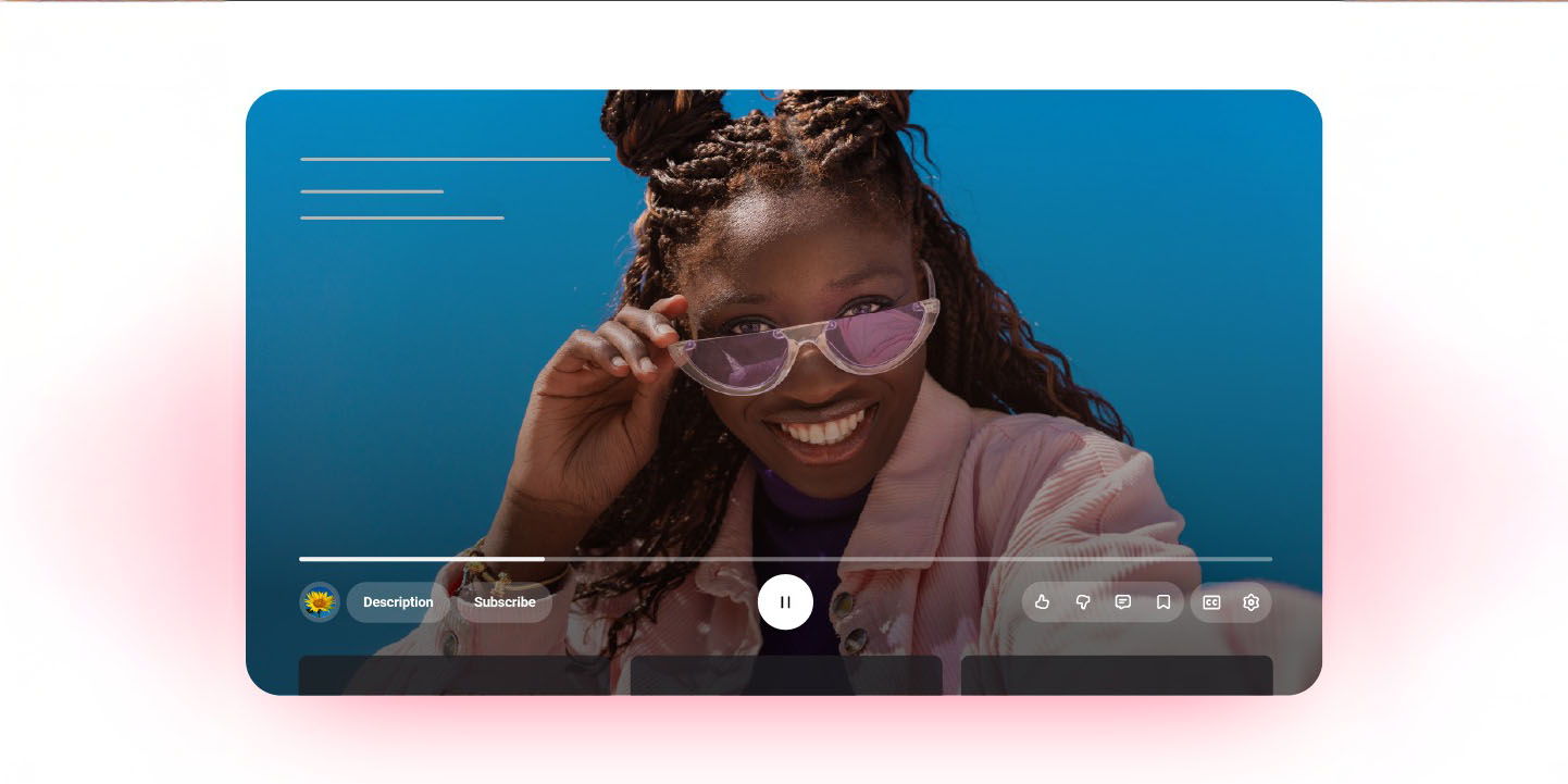
This new video player finally hit my Google account on Wednesday afternoon, and I have to say, it felt pretty jarring. On the web, I’m someone who traditionally keeps videos locked to theater mode for a more immersive experience, filling up most of the window without completely blocking out the rest of my desktop. Unfortunately, combined with a fairly large 32-inch monitor, I think I ran into the worst first impression you can get from this new UI. The new playback controls look so large and expansive, it genuinely looked broken at first glance — a feeling not helped by a screenshotting extension I have installed that actually is visually broken post-update.
Even setting that third-party glitch aside, I have to say, I don’t think I like this experience much at all. The semi-translucent button borders are significantly more difficult to see now, while the opaque white buttons themselves actually take up more space than before. It’s a visibly messy experience than feels like it’s trying to take up less screen real estate while simultaneously taking up much, much more. I also just don’t think it’s particularly easy to see the buttons compared to YouTube’s previous layout. At least on mobile, everything’s a little more condensed.
With most of my complaints coming from the desktop experience, though, I wouldn’t be surprised if readers have a completely different take than mine. Scrolling through the comments on our news coverage of this week’s update, it seems like people on mobile — where everything is far more condensed, and it properly accounts for the curved corners of modern devices — and TVs have far less of a problem. But, on the other hand, it’s not uncommon to hate change, and I wouldn’t be surprised if Google’s actions here split an audience in half.
So, what do you think? Are you pro-YouTube’s redesign, translucent buttons and all, or are you already missing that older layout? Definitely expand on your thoughts in the comments, particularly if you’re someone who likes it on a specific platform — like TVs or mobile — over others.
FTC: We use income earning auto affiliate links. More.