
Following Calculator, Google is rolling out a Material 3 Expressive redesign for Android’s Clock app.
Google Clock stops using the tall bottom bar, while the large FAB is now a square in the bottom-right corner instead of being a centered circle.
The Alarms tab now leverages a full background highlight to make obvious what is active. This is better than relying on the toggle and bolded font. When you tap a card, a sheet slides up to make edits instead of the previous inline interface. Containers are used to helpfully group related functionality.
Old vs. new
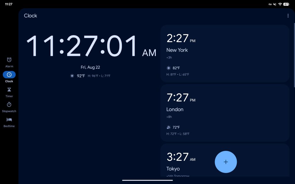
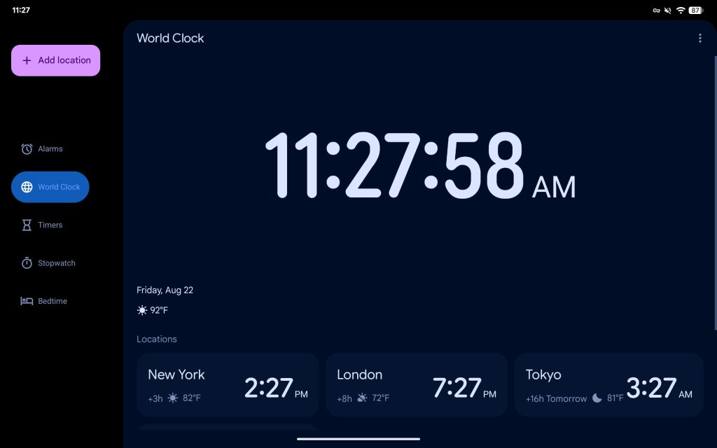
The World Clock — with a new bottom bar icon — tab starts by separating the time from the day/date, temperature, and active alarm line. Google has unfortunately removed the high and low for each city (as Pixel Weather gains that in its homepage).


The Timer tab’s layout is unchanged, though names are larger and you see the new font on display. The bottom bar icon has been rounded.


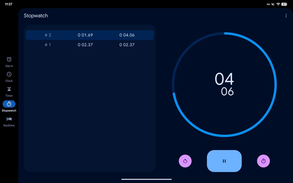
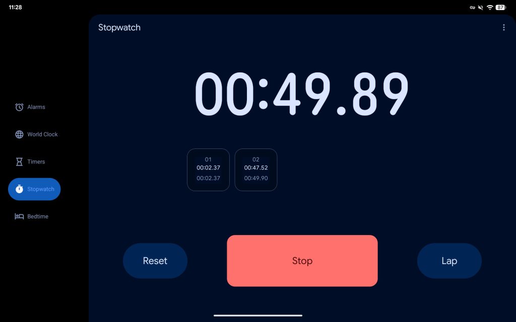
The Stopwatch tab makes use of very large buttons stacked on top of each with text labels instead of icons. Meanwhile, square cards are used for lap times instead of the previous list approach.


Bedtime is the same, while most items in the three-dot overflow menu are now accompanied by icons, just like in Calculator. There are no changes to the homescreen widgets.


On tablets, there’s an expanded navigation rail with the text label displayed to the right of the icon. The floating action button has been moved to the top. Overall, Google has dropped the two-column layout across most screens.
Old
New
Google Clock 8.1 with Material 3 Expressive is rolling out now via the Play Store.
FTC: We use income earning auto affiliate links. More.